client: Belgium is Design
Work: Belgium is Design visual identity
Date: 2018
Project developed in: Kidnapyourdesigner
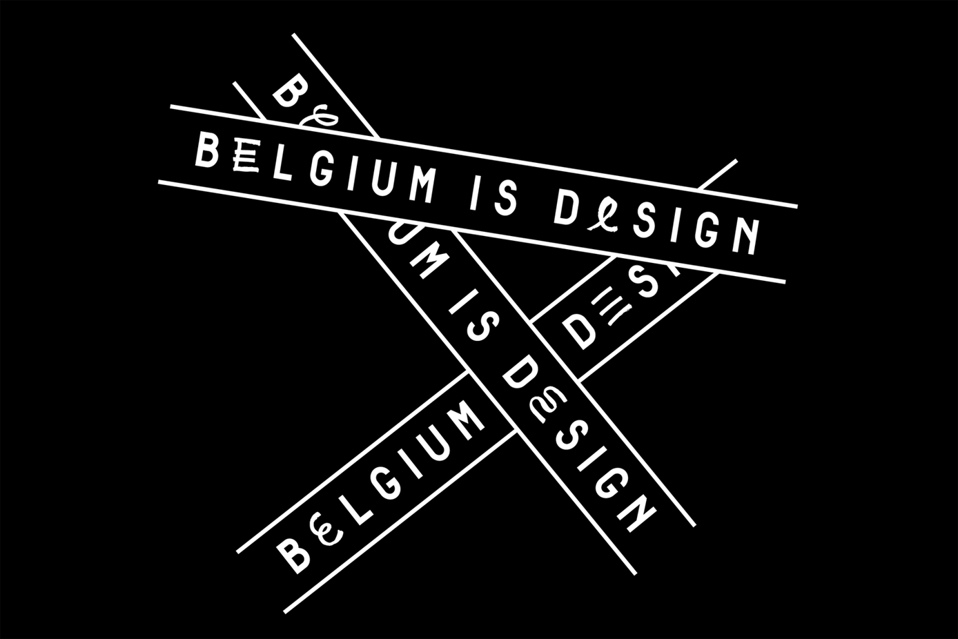
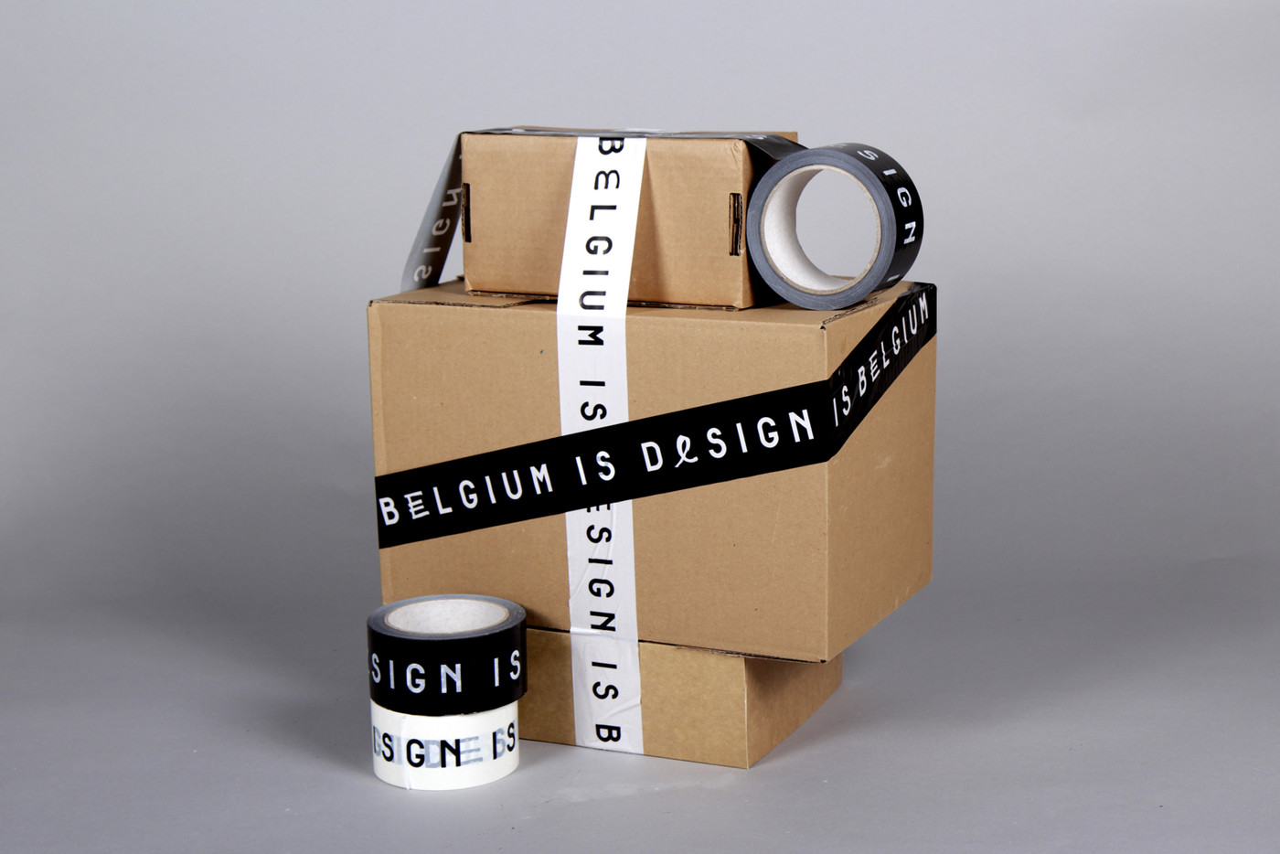
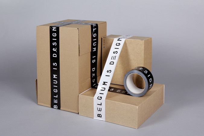
With a new specific approach here, the letter E, which is constantly repeated, is a reference to drawing, to the act of writing, to the genesis of a project and characterises the label’s identity. The principle of repetition, as an industrial aspect of design, is also totally part of the new graphic design identity.
The Alfphabet family is based on the Belgian road signage called ‘Alphabet’ in French and ‘Alfabet’ in Flemish. It was introduced in 1945 by 3M system working for the Marshall plan after the end of the war. In 1975, it was replaced by the Swiss SNV fonts, but it is still in use here and there on Belgian railways and the Charleroi metro. In the early nineties, Pierre Huyghebaert was able to copy the original plates just before the split of the national office of the roads ‘Fond des Routes’ into three regional entities and the burial of the documents deep into regional archives.
Alfphabet Condensed is a rough merge between Alfphabet II (condensed caps only) and Alfphabet III (semi-condensed lowercase only!). It was redrawn on various occasions by Karl Bassil and Pierre under Hammerfonts umbrella in Brussels, then completed at Mind the Gap studio in Beirut by Karl with the help of Nadim Zablit in the late nineties. The contrast between uppercase and lowercase is still quite non-typographic, and lots of diacritics need improvement.
Alfphabet IV was redrawn by Pierre Huyghebaert and Ludi at Speculoos studio in 2007. Modified in 2018 by Kidnap Your Designer for Belgium is Design and Sophie Boiron with 12 alternate E glyphs.This version has a larger width and a substitution of lowercase to uppercase.
+ info: www.belgiumisdesign.be
Work: Belgium is Design visual identity
Date: 2018
Project developed in: Kidnapyourdesigner
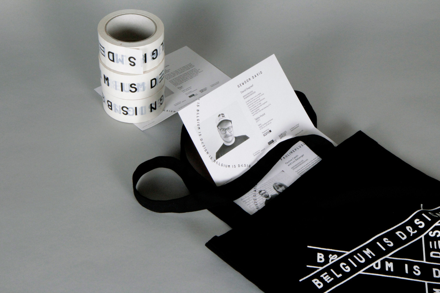
With a new specific approach here, the letter E, which is constantly repeated, is a reference to drawing, to the act of writing, to the genesis of a project and characterises the label’s identity. The principle of repetition, as an industrial aspect of design, is also totally part of the new graphic design identity.
The Alfphabet family is based on the Belgian road signage called ‘Alphabet’ in French and ‘Alfabet’ in Flemish. It was introduced in 1945 by 3M system working for the Marshall plan after the end of the war. In 1975, it was replaced by the Swiss SNV fonts, but it is still in use here and there on Belgian railways and the Charleroi metro. In the early nineties, Pierre Huyghebaert was able to copy the original plates just before the split of the national office of the roads ‘Fond des Routes’ into three regional entities and the burial of the documents deep into regional archives.
Alfphabet Condensed is a rough merge between Alfphabet II (condensed caps only) and Alfphabet III (semi-condensed lowercase only!). It was redrawn on various occasions by Karl Bassil and Pierre under Hammerfonts umbrella in Brussels, then completed at Mind the Gap studio in Beirut by Karl with the help of Nadim Zablit in the late nineties. The contrast between uppercase and lowercase is still quite non-typographic, and lots of diacritics need improvement.
Alfphabet IV was redrawn by Pierre Huyghebaert and Ludi at Speculoos studio in 2007. Modified in 2018 by Kidnap Your Designer for Belgium is Design and Sophie Boiron with 12 alternate E glyphs.This version has a larger width and a substitution of lowercase to uppercase.
+ info: www.belgiumisdesign.be
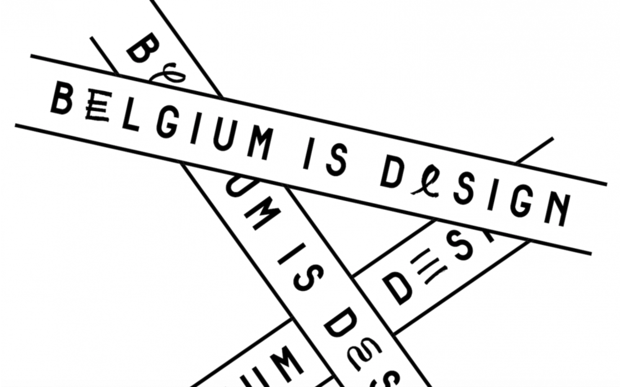

the logo construction


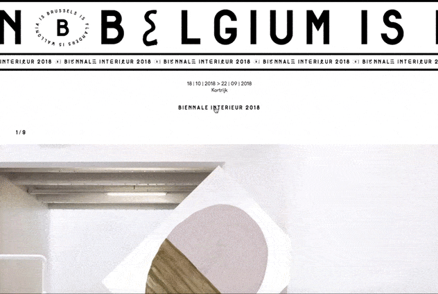
webpage
devolped by: geometry
devolped by: geometry